My Final Magazine Layout
My experience in InDesign was good. It took me a bit to figure out how to use a few things such as tools but I eventually got used to it. Managing the text boxes and placing in photos was easy.
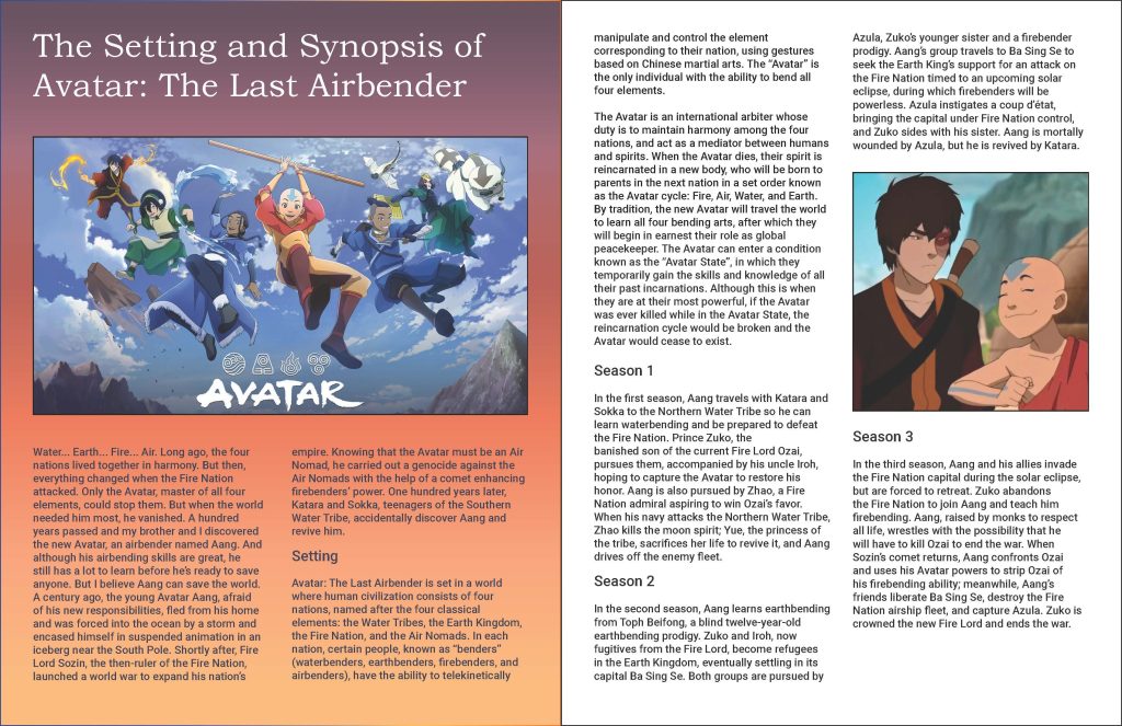
It took a few tries before I ended up with my final choice. The font and size was the first thing. The smallest font size is the body paragraph being 12 pt following accessibility standards. I used a sans serif font for the body paragraphs and a serif font for the title. Next came designing. For the first page, I instantly knew I wanted the title on top, then the image, then having the paragraph start under the image. While doing the gradient background, I had trouble using the gradient tool the most as sometimes it just wouldn’t seem to work. I eventually was able to figure it out and tried using colors that the show, Avatar: The Last Airbender uses. It wasn’t working as well at first so I decided to use some other sunset colors and made the final gradient background that I like.
For the second page, I wanted to keep a white background that I saw a lot of magazine spreads using, and I wanted it to focus more on the text but also include one more picture. I designed the layout in a way that made it easy to read through and that the picture only occurred in-between paragraph breaks, that being between the paragraphs talking about season 2 and season 3.
I certainly see InDesign as very useful when creating text-based publications such as magazines, books, or articles that require creating a layout to format everything, even pictures and designs included in the text. I think I would use this in my personal, work, or school-related projects if I need to create a layout the includes the use of text and images. InDesign is helpful and useful in creating a manageable layout design, so I would use it if I need to design a layout for something.